
Make it stand out.
Add a banner for LA Fitness
Either a video or a photo
CTA: “Join me on a journey to explore how less is sometimes more”
Cut through the noise —
stay focused, inspired, motivated, fit, and above all, unstoppable!
Who are they?
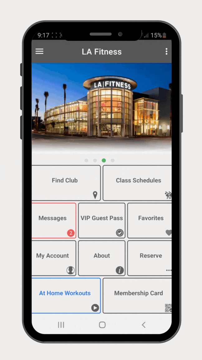
Founded in 1984, LA Fitness is a leading fitness brand with state-of-the-art clubs across the continent. However, its mobile app struggled with usability, outdated design, and limited features. My goal was to reignite user interest and enhance engagement.
PROJECt typeCapsule Project @ Careerist
roleUX/UI Designer
timeline4 months
💡The brief
Select a website or mobile application you regularly utilize and believe could use a refresh.
Choose one key user element to improve or redesign.
Follow a streamlined user-centered design process to master the fundamentals of UX design.
Optional Challenge: Dive deeper by rebranding the chosen product—but be prepared for extra effort!
Pro Tip: Pick a platform that offers a UI kit to save time. Feeling ambitious? Creating one from scratch is encouraged but not required.
And, of course, I couldn’t help but go the extra mile — as usual😅Powering through the challenge!
CHALLENGE #1Focusing on improving a single, impactful feature of the application
exampleThe application offered numerous features, but users primarily relied on it for gym check-ins, leaving other functionalities overlooked. With limited resources and a tight timeline, I had to determine which feature could deliver the most value and positively impact user engagement
impactThis restriction created challenges in identifying and focusing on a feature that would deliver meaningful value
CHALLENGE #2Re-branding the app to appeal to all genders while reflecting the company’s Southern California roots — to better represent its identity
exampleUsers just couldn’t relate to the app’s logo and colors. It didn’t feel connected to the company’s name or its Californian vibe, and it didn’t grab their attention
impactDue to the design not reflecting the company’s true identity, users didn’t connect with the app, making it harder to build brand trust and recognition
CHALLENGE #3Overcoming limited resources to engage users beyond gym check-ins and encourage them to explore the app’s full features
ExampleLA Fitness didn’t have a comprehensive branding kit, nor did it have useful analytics like user activity patterns or engagement trends to guide decisions on how to improve user experience
impactDue to the lack of analytics, I had to rely heavily on other research methods, which meant there was a risk of missing key insights or having to fill in the gaps
Discovery
To come up with solutions that really worked for LA Fitness, I first needed to see what other gym and fitness apps were doing to keep users hooked. I dug into how they represented their brand and what features were keeping users engaged by doing a deep competitive analysis. That gave me a better idea of what worked—and from there, I started thinking about how I could bring those same results to LA Fitness in a way that felt true to their brand. One of the goals was to update the app with fresh, modern features that users would actually love and keep coming back to.

[ COMPETITIVE ANALYSIS - TAKEAWAYS ]A few clear gaps stood out the most against its three main competitors:
Missing progress tracking: Unlike its competitors, LA Fitness did not give users a way to track their workouts or see their progress over time. No stats, no history—nothing to motivate them to keep going.
No in-app purchases: Other fitness application were offering easy ways to upgrade for premium features or purchase add-ons or even merchandise directly in the app. LA Fitness? Nothing.
Poor user experience: Certain buttons and functionalities did not work, had confusing navigation, and a clunky interface made using the app more frustrating than motivating or helpful.
Membership upgrades and downgrades were a hassle: If users wanted to change their membership, they were stuck jumping through hoops. Competing apps made this process quick and easy, while LA Fitness turned it into a headache.
Laying it all side by side made it clearer why user retention and engagement were low. I knew more work was needed to figure out exactly how to fix these gaps, but this analysis gave me a solid starting point. It was time to hear directly from users who actively used gym and fitness apps to validate my findings.
Users did not hold back!
Due to the nature of this case study, I interviewed family and friends—while they didn’t use the LA Fitness application, I knew they were into fitness and regularly used other fitness apps.
It gave me the chance to really listen to what they cared about—what they looked for and what frustrated them. I was confident it would help me compare their feedback to the issues I had already found through my competitive analysis of LA Fitness, and from there, be able to begin brainstorming ways to improve the application and focus on what really needed to change to make a meaningful impact.
And did I confirm my assumptions from their insights? Yes, and so much more!
From the few insights displayed below, the following data was verified:
Frustration
🧠 Connected to: “No motivation or milestones” insight
Users spoke, I listened
Here’s what was revealed…
The insights I gathered and verified through user feedback made it easier to formulate recurring themes and be able to spot patterns:
Theme: Frustrations

Patterns Identified:
Excessive steps for simple tasks
Cluttered and disorganized content
Unavailable features and unresponsiveness
Theme: Work-out Preference

Patterns Identified:
Strong preference for solo workouts
Group classes boost motivation for some
Preference shifts based on mood/workout type

💬 What Laura said:
She was frustrated that she couldn’t book for more than one person — especially when trying to schedule something with her daughter. It just felt like a waste of time.
📝 My observation:
The app isn’t flexible enough for people who want to work out with someone else. It feels like it’s made more for solo users, and that can be discouraging for people trying to build habits with a partner or family member.
Challenge
Aligned to the finding: "Membership upgrades and downgrades were a hassle"

💬 What Maria said:
She said adding macro, calorie, and nutrition tracking to the gym app would be super helpful, even if it cost a little extra.
📝 My observation:
Users see value in paying more for all-in-one fitness apps that make tracking everything simpler and more convenient.
External Motivation
🧠 Connected to: “No motivation or milestones” insight
Theme: Design/UI Preference
Patterns Identified:
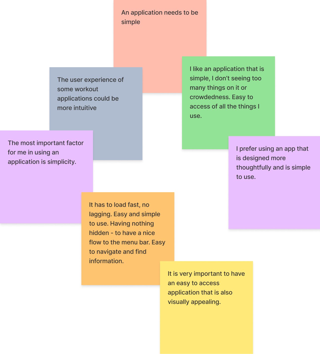
Simplicity is highly valued
Fast-loading, intuitive navigation is a must
Dislike of cluttered and crowded user interface
Theme: Motivation — Rewards

Patterns Identified:
Rewards drive higher gym attendance/engagement
Earning milestones increases app and gym loyalty
Discounts, freebies, & gift cards are strong motivators
[ affinity mapping - takeaways ]Through affinity mapping, I was able to uncovered clear patterns around frustrating user flows, overwhelming UI, and not enough meaningful progress tracking. I also found that people valued working out independently, wanted easier ways to get support and connect if they wanted to, and felt more motivated when rewards were part of the experience.
Even though the users interviewed did not use the LA Fitness app, their insights gave me a strong foundation of what users expect to received from fitness applications. From there, I moved into a full usability of the app — exploring every feature, flow, and interaction to spot where it met user needs and where it fell short.
Theme: Progress Tracking

Patterns Identified:
Nutrition and diet tracking
An all-in-one dashboard with stats
Tracking calories, steps, overall progress
Theme: Accessibility

Patterns Identified:
Desire for social features to connect
Need for personalized workout guidance
Video instructions to reduce intimidation

Progress Tracking
Directly tied to the analysis insight: "Missing progress tracking"

UI Preference
Connected to the analysis point: "Poor user experience"

💬 What Minjee said:
She shared that redeeming points for rewards like Starbucks gift cards, keeps her motivated to continue reaching her fitness goals.
📝 My observation:
Reward programs tap into external motivation and make fitness feel more fun and rewarding. Having tangible incentives, like gift cards, can boost consistency and encourage users to stick with their fitness routines.
Internal Motivation (with a bit of external)
Linked back to the finding: "No motivation or milestones"
[ user interviews - takeaways ]
The above is just a small sample of all of the questions I had asked during the interviews. I had put together 15 open-ended, general questions about fitness apps. This was the best approach for this case to gather real, honest feedback as open-ended questions allows users to speak freely and share deeper insights. This technique helped me better understand their needs and frustrations; but things didn’t exactly go as planned.
⚠️ Roadblock: ⚠️
Once I started my interview with the first user, I realized I had to reword some of my questions—or even ask follow-up questions—to better match their experience and the app they were using. By the time I wrapped up with my second user interview session, I was already getting the hang of how to ask better questions on the spot and tweak my original ones as I went along. This adaptation helped me keep things structured across all interviews while maintaining space for natural conversation.
(thoughts you'd Not Expect)I was surprised by some of the feature ideas users shared—out-of-the-box suggestions that, as far as I knew, no competitors were offering. While I couldn’t explore them further due to time constraints, it was an eye-opening reminder of how valuable user insights are. It reinforced just how crucial it is to listen to users—not only to uncover pain points but also to discover innovative opportunities we might not have considered otherwise.
Desired Feature
Another feedback tied to: "No motivation or milestones"
💬 What Moe said:
He wishes fitness applications made it easier for users to handle billing and account updates themselves to avoid time-consuming hassle.
📝 My observation:
The app’s lack of self-service options leads to frustration and wastes users’ time, making simple tasks feel way harder than they should be.
💬 What Dhrashti said:
She said having a personalized, step-by-step workout and nutrition plan in the app would make the gym feel less intimidating and easier to navigate.
📝 My observation:
Without clear guidance, users can feel overwhelmed at the gym; personalized plans could boost confidence and motivation.
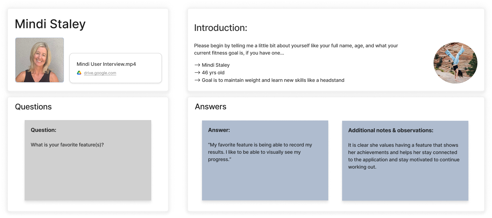
💬 What Mindi said:
She said her favorite feature is recording her results because seeing her progress visually keeps her motivated.
📝 My observation:
Visual progress tracking helps users stay motivated by making their achievements more tangible.
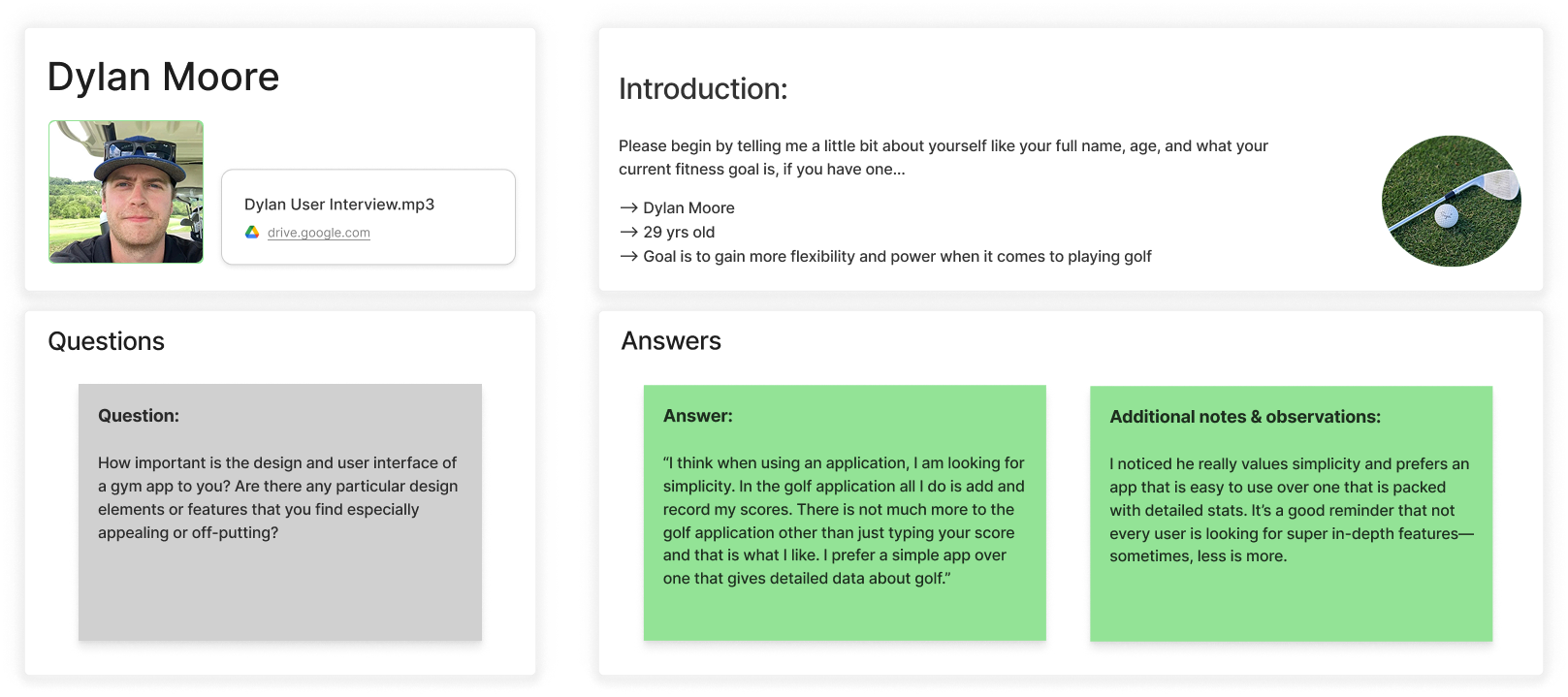
💬 What Dylan said:
He said he prefers simple apps focused on basic functions, like recording scores, rather than apps overloaded with detailed data.
📝 My observation:
Users appreciate clean, straightforward apps that prioritize ease of use over complex features.
Bugs: certain functionalities of the app are non-responsive
Outdated design: visually unengaging and disconnected from the brand's color scheme, lacking a cohesive design that aligns with the brand identity
Cognitive overload: too much text, making it difficult to process information quickly
Navigation confusion: various options with no real hierarchy - hard to determine which action is most important or relevant
User motivation gap: application lacks engaging features that inspire users to actively interact with
[ application audit - takeaway ]The audit pulled everything into focus. It confirmed what users had been expressing and showed exactly where the app was falling short—from broken features to an interface that didn’t reflect the brand or support user goals. Seeing it all side by side made it clear where the app was missing the mark—and what needed to change to make it actually useful and motivating.
Unlocking Consumer Behavior
When searching for public insights about the LA Fitness mobile app, I couldn’t find specific market research focused on it. However, I did find research related to LA Fitness’s website. Because the website and app offer similar features like managing memberships, booking classes, and accessing gym services, I used the available website data to make thoughtful assumptions about user needs for the app—prioritizing easy navigation, mobile responsiveness, and quick access to important fitness tools.

[ market research - takeaway ]Digging into the market research helped me connect the dots between user behavior and the app’s biggest pain points:
Strong brand awareness isn’t enough if users aren’t staying engaged
The mobile experience feels clunky, even though that’s where most users are coming from
Today’s fitness-focused users expect things to just work—fast and intuitively
Important features like scheduling and memberships aren’t as easy to use as they should be
Design and functionality issues are creating friction and driving people away
These insights gave me a clear direction for how to move forward—starting with quick sketches and low-fidelity wireframes to begin shaping a smoother, more focused experience.
Research
As someone who used the LA Fitness app pretty regularly, I was honestly surprised by how little I actually knew about it. I had only ever used it to check in at the gym—and that was it. Once I stepped into this project and started digging deeper, I realized how much more there was to explore (and how many opportunities were being missed).
So, I did a full usability audit to get the full picture. That’s when things really came into focus:
How might we redesign the
LA Fitness app for a more engaging
and user-friendly experience?
Sketches - low-fidelity

explain why i made these specific design decisions
- QR Code first thing users see when they login to the app - size of it
- amount of questions when signing up
- options to quick login : facebook, insta, appleid
- four tabs
- shape of progress bar - why add one?
etc..
Usability Test
What was observed?
Based on insights gathered from user interviews and iterative design solutions aimed at enhancing user engagement with the LA Fitness application, a usability test was conducted.
What worked:
Simple signup process requiring only necessary information
Seamless user experience
Easy-to-understand and navigate interface
Convenient gym check-in feature
Relevant tabs for easy access
Effective system for tracking points towards rewards
What needed further improvement:
Addition of option to login through Apple ID
Clarification of redemption process for rewards
Removal of unnecessary "Instructor's Column" under attendance section
Lacking a LA Fitness UI kit and brand guideline, I had the freedom to redesign the application as I saw fit.

During the development of LA Fitness' new brand identity, I embarked on a deliberate process to encapsulate their ethos and vision.
Color Psychology: Opting for the color green, symbolic of growth, health, and freshness, aimed to resonate with the audience's aspirations for vitality and well-being.
Logo: Drawing inspiration from the iconic imagery of Los Angeles, I integrated palm trees into the logo design to evoke a sense of local identity and strength.
Typography: "Poppins" was meticulously chosen for its versatility and legibility, ensuring the brand message remained clear and accessible across various platforms.
Iconography: To ensure user-friendly navigation, I opted for simple and easily identifiable icons, each paired with clear tab names for quick and intuitive recognition. This approach aligns with the feedback received from the user interview, emphasizing the importance of simplicity and straightforwardness in the application design.
This cohesive blend of elements embodies the commitment to fostering a dynamic and inviting space centered around wellness and vitality.
Reimagining LA|Fitness
user flow - low fidelity screens
Final Design
Advised to prioritize one feature to provide a functionality and a fresh feel, and after reviewing user interview feedback, enhancing the rewards program emerged as the optimal approach. Through extensive design efforts, including creating a new logo, selecting icons, incorporating a progress bar, and leveraging color psychology, I seamlessly integrated these elements to craft a cohesive, engaging, and user-friendly application.
Integrated options for easy login/sign-up via Facebook, Instagram, Google and Apple ID to enhance user accessibility and experience
Designed the sign-up form to be concise and intuitive, requesting only essential information for a streamlined user experience
Upon login, implemented the QR code on the homepage’s top center to ensure convenient and swift access for users
Login/Sign-Up Screens
Given the rewards program's significance to users, I streamlined access by integrating a quick pathway from the home page
Implemented a progress bar on the rewards hub page, enabling users to track their point accumulation until they are ready to redeem them for enticing rewards
Users can easily check available rewards and their points. When the "redeem" button is green, they can initiate redemption smoothly
The Rewards’ “Hub”
Integrated attendance, challenges, milestones, and rewards' history on the rewards' hub screen to illustrate their link to the program and provide users with convenient access to view and track their accumulated points
Added an information icon to provide users with guidance and additional information about the functionality of the progress bar
Designed for convenience and simplicity, users can easily view completed and pending tasks in challenges and milestones, with expandable options for more details.
Similarly, scrolling on attendance and rewards' history pages simplifies tracking gym or class attendances, identifying earned points' sources
The Rewards’ Extension Screens
Successful Impacts
Following a second usability test, which garnered favorable feedback, participants were guided through a brief satisfaction survey at the end.
By comparing responses before and after implementing changes, the following impacts were measured
-
Organization and Clarity
In a subsequent user interview comparing the old and new designs, users awarded higher rating scores and expressed positive feedback on the enhancements. They praised the improved ease of navigation, user-friendliness, simplicity, and reduced clutter, attributing these to well-organized content. Calculations based on the change in users' rating scores indicated an estimated 47.5% increase in user satisfaction.
-
Functionality and Visual Appeal
Users' rating scores between the two designs showed a 50% increase in engagement. This was attributed to streamlined gym check-ins, cohesive elements improving functionality, and easy access to rewards, which enhanced usability and motivation. Users also appreciated the calming green color scheme, contributing to a wellness-oriented vibe in line with gym app expectations and ultimately encouraging regular app usage.
-
User Experience and Motivation
Users' feedback and improved ratings reflected a significant a 67.5% increase in user retention. Mainly, this improvement was attributed to the enticing rewards offered by the application. Users expressed their willingness to work hard to complete challenges and milestones to accumulate points for redeeming these rewards. Additionally, motivating statements of encouragement across the app and the overall simplicity of it, contributed to an enhanced user experience and motivation.
Key Takeaways
Navigating in a new career path is a challenging yet rewarding journey. Immersing myself in a project aligned with my interests provided an invaluable opportunity to apply critical thinking and creativity. As a beginner, I embraced the learning curve and gleaned significant insights throughout the process, fostering personal and professional growth.
-
Accessibility Guidelines
By integrating dark mode with accessibility guidelines, I learned to prioritize user experience for diverse audiences. Considering contrast ratios, color schemes, and user preferences highlighted the importance of accessibility and inclusivity in design decisions, fostering more user-friendly digital experiences.
-
Cohesive Design System
An essential lesson learned was the significance of developing a cohesive design system. Unified elements like color and typography ensure consistency across any framework, enhancing visual appeal and enabling easier scalability and maintenance. Moving forward, I will continue to prioritize this approach.
-
The Importance of Labeling
A lesson embraced during this project was the importance of labeling every element on Figma to ensure clarity and efficiency throughout the design process. It is a lesson I will be taking with me on future endeavors since it also promotes seamless collaboration among team members, facilitating smoother design iterations.
-
Interactive Prototype
An invaluable lesson was recognizing the pivotal role of interactive prototypes. They not only refine user interactions but also serve as powerful tools for presenting design concepts to stakeholders, ensuring alignment with the desired vision. I am committed to refining these skills to continually improve and grow as a designer, with the overarching goal of delivering optimal user experiences.
“Maria possesses impressive design skills, marked by an exceptional attention to detail and a true love for artistic expression. Throughout our course, her work consistently showcased creativity and an unwavering dedication to achieving the highest standards of excellence.”
- Rose Anne J.
UX Support Analyst
Testimonials
“Maria is an exceptional designer known for her strategic mindset, very precise attention to detail, and unwavering commitment to every phase of the design process.”

- Victoria Zhuk
Product Designer